It's Park[ing] Day Today!
Tons of people in major urban cities around the world are taking back what belongs to them! Parking spots are being converted into mini parks if only for a day to take advantage of some of the most wasted space in cities.
Enjoy the video, which does a much better job at explaining than I did. And picnic out next to a meter!
9.17.2010
9.11.2010
OMA, Oh La La!
So, in case it hasn't been noticeable enough, let me proclaim my love for anything digital/graphic/animation/design related! I love the arts and architecture off course, and when two of my biggest interests come together, I just get a happy and fuzzy feeling inside!
This time, OMA [Office for Metropolitan Architecture] has taken care of my morning excitement by making me look forward to my career in this ever-growing industry of design!
They are recently implementing this new technique of using videos to present their proposals and competition entries. The idea is not only innovative and fascinating for professionals in our field, but a brilliant way to bring professionals from other industries into a common denominator, ARCHITECTURE.
Another advantage is that videos are a very friendly way to explain architecture concepts to those who don't necessarily take interest in reading long articles or looking at plans and sections which are sometimes hard to understand. This way, the essence of the project is is presented in a way that can not only be seen in all dimensions, but can also implement cultural factors that are sometimes hard to communicate on paper or 2D graphics [such as street interviews, music, etc.]
Take a look for yourself. This is Oma's [Rem Koolhaas] Hong Kong West Kowloon Cultural District master plan proposal.
"This is the way to inspire creativity, with creativity, we can generate the power to propel culture into a new dimension" and OMA is certainly taking things into a new dimension.
Go OMA and Go Rem! [you look great in 2D btw]
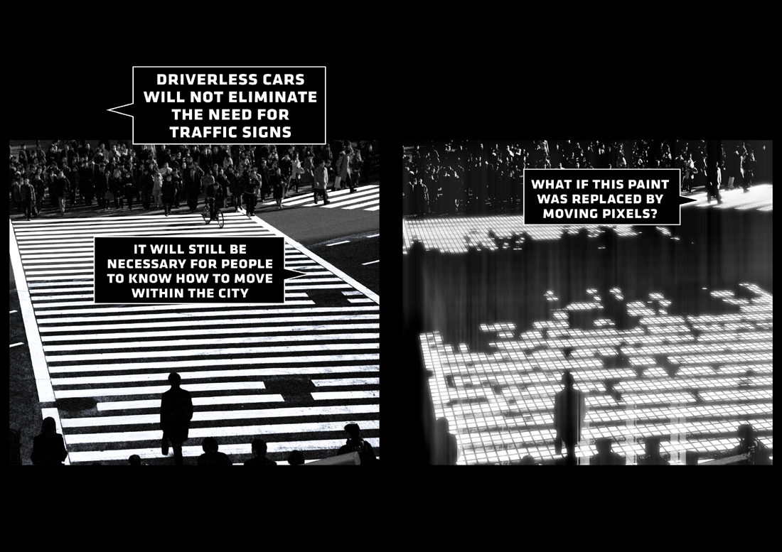
PS. Here's another one I found by BIG: a proposal for the Audi Urban Future Award, which unfortunately didn't win, but the proposal is quite innovative and technological. It incorporates an idea of "[Driver]less is more" which proposes a driverless city and smart street design. The idea would implement pixel light into the streets like so:

Which is quite exciting!!
Here's the animation:
Enjoy!
Books on Rem Koolhaas / OMA
This time, OMA [Office for Metropolitan Architecture] has taken care of my morning excitement by making me look forward to my career in this ever-growing industry of design!
They are recently implementing this new technique of using videos to present their proposals and competition entries. The idea is not only innovative and fascinating for professionals in our field, but a brilliant way to bring professionals from other industries into a common denominator, ARCHITECTURE.
Another advantage is that videos are a very friendly way to explain architecture concepts to those who don't necessarily take interest in reading long articles or looking at plans and sections which are sometimes hard to understand. This way, the essence of the project is is presented in a way that can not only be seen in all dimensions, but can also implement cultural factors that are sometimes hard to communicate on paper or 2D graphics [such as street interviews, music, etc.]
Take a look for yourself. This is Oma's [Rem Koolhaas] Hong Kong West Kowloon Cultural District master plan proposal.
"This is the way to inspire creativity, with creativity, we can generate the power to propel culture into a new dimension" and OMA is certainly taking things into a new dimension.
Go OMA and Go Rem! [you look great in 2D btw]
PS. Here's another one I found by BIG: a proposal for the Audi Urban Future Award, which unfortunately didn't win, but the proposal is quite innovative and technological. It incorporates an idea of "[Driver]less is more" which proposes a driverless city and smart street design. The idea would implement pixel light into the streets like so:
Which is quite exciting!!
Here's the animation:
Enjoy!
Books on Rem Koolhaas / OMA
9.05.2010
'The coiled sexual power of a jungle cat!'
Oh, Woody... You make me shiver!
He really knows 'all the angles... Corny, too conny for my taste...'
Wait for me Manhattan, when I make it there, I'll make it.
And just for comparison and graphic fun, here's Woody's modern/graphic doppelganger :)
Enjoy!
He really knows 'all the angles... Corny, too conny for my taste...'
Wait for me Manhattan, when I make it there, I'll make it.
And just for comparison and graphic fun, here's Woody's modern/graphic doppelganger :)
Enjoy!
8.25.2010
An Arrangement of Electronic Phonemes!
I've got it! The value of a word as a picture is an electronic phoneme!
Phonemes are the smallest contrastive unit in the sound system of a language. They form a group of slightly different sounds, which are all perceived to have the same function by speakers of the language or dialect in question. Each of these sounds has a correspondent character; they are somewhat like the phonetic pronunciation written in the dictionary. Now, electronic phonemes take into account the physics of turning sound into electrical impulses, like the sound spectrograph, which turns speech into pictures, (aha!) breaking speech into pitch and loudness and providing the possibility to create artificial speech through a picture! Amazing, huh? Confusing? Yes...
Please allow me to explain further. During my Internet quests, I tend to look for material that although not targeted to exercise my ability to critically think, bring me to a process of diagrammatic thinking on some popular aspect of life. First, I was brought to the quote that currently heads my ongoing poll, (this reminds me to tell you that none of the answers are correct) which has lingered on my head for quite some time. Then, I found a few pieces that inspired me to write about language and the ability of human beings to communicate. Later, I thought that through the analysis of a picture and the resulting generation of an animation my question had been solved, but now everything has finally come together, and the answer lied in a 1959 educational movie.
'Telephoneme' is the most recent animation short by MK12, a design firm from Kansas City, Missouri. These geniuses have taken parts and pieces from the educational film from 1959 'The Alphabet Conspiracy', which is based on the story of a little girl named Judy, who falls into a deep dream after being frustrated with her grammar homework. She dreams of conspiring to destroy the alphabet and free herself from grammar homework, partnered by the Mad Hatter and Jabberwocky, who come out of the Alice in Wonderland book that lies in a magic giant library. They are also determined to free themselves from living in a book. Although the animation from MK12 takes the story to a fictional and much darker mood, it was through this animation that I started to analyze and realize how underrated language and speech are in current society.
Just watching this perfectly put together work of audiovisual art made my brain feel the need to explore. I found what inspired it and how it was created. The terrific audio mix, which was partially borrowed from the original film, and the editing techniques, such as the spliting of elements into their pragmatic color channels, succesfully gives this short the feel of a 1950's top secret footage from outer space! Maybe it is taken a bit far, suggesting that language is out to get us, but is all in the good fun of science fiction. [more info at http://telephoneme.tv/ ]
Anyhow, I hope this spectacular piece of art gets your brain as excited as it did mine. I have also found the original 1959. Although it is 50 minutes long, it is so entertaining and easy to watch. It does a much better job at explaining electronic phonemes than I did and it definitely teaches you a thing or two about dialects, languages, and the importance of grammar and the alphabet...
Perhaps if children today were still being educated with such high quality content television as the baby boomers were taught back i the day, our society would be a much more aware and educated one today. Although if it hadn’t been for the pioneers of the 50’s, I wouldn’t be questing on the Internet and writing about physics today.
Enjoy!
Search Amazon.com for The Alphabet Conspiracy
8.19.2010
"The Value Of The Word As A Picture"
Since I've lingered around this idea of the value of the word as a picture, I saw it fit to share a couple of shorts I came across on Vimeo, which I thought were kind of relevant to this playful idea. Canon is been holding a contest called "The Story Beyond The Still" where photographers are asked to interpret a story behind an image given to them and compose a short fiction movie in HD following a constant storyline. The contest is composed of mini contests, and one episode is added every month or so. At the en of every episode, a still is left as inspiration for the following episode and so on. So far, 6 amazing shorts have been created and I've been hooked since. I'll post the first 6 in order and will keep updating you on any added episodes.
Enjoy,
Here they are:
Chapter 1: The Cabbie
Chapter 2: Job Security
Chapter 3: The Beach
Chapter 4: Allison
Chapter 5: Miracle
Chapter Six: Fool Circle
So far, I can't wait for the next one!!
Enjoy,
Here they are:
Chapter 1: The Cabbie
Chapter 2: Job Security
Chapter 3: The Beach
Chapter 4: Allison
Chapter 5: Miracle
Chapter Six: Fool Circle
So far, I can't wait for the next one!!
8.01.2010
Architecture Grand Finale!
I finally received the piece of paper that certifies by the governor, the dean and all of those people with the pretty signatures that I, in fact, have a Bachelor's degree in Design with a Major in Architecture! [phew! and woohoo!]
Four years of model building and nonstop drafting, endless 3-D modeling and rendering hours, over 380 gallons of coffee and tons of sleepless night finally got me a piece of paper with funky looking, curly font! What a relief!
Sarcasm aside, I thought I'd celebrate [3 months after graduation] with a little architecture knowledge and throw in a couple of interesting projects I've seen lately. I also thought, 'why not dedicate every end/start of the month to ARCHITECTURE!' After all, I did spend forever learning about it, I might as well share a bit of what I know best and love most... But don't worry, I won't drown you in Architecture; I'll keep up with the other things as well.
And in talking about curly font and people with pretty signatures, I was reminded of Salvador Domingo Felipe Jacinto Dalí i Domènech.
Yes, most widely know as Salvador Dalí, though that was also his father's and brother's name. This eccentric surrealist Catalanian, known for his twisted and highly symbolic art [not to mention extremely hard to understand, and appealing mostly to adolecents of the time] is having his collection moved to... Of all places and very close to home... The beautiful but somewhat uninteresting St. Petersburg, Florida! Lucky us Floridians!
The collection's new house obviously has to be worth of Dalí's twisted personality and work, which is where professionals in my field come in, to build fantasy with concrete! Ah.. Architecture!
This time it was the architecture firm HOK, with Yann Weymouth in the lead, who took charge in designing a space as fantastic and surreal a Dalí' and his art.
The building is deeply inspired by Dalí's collection, combining realistic and classical elements with the fantasy of the contemporary. Dalí would be pretty proud.
The building has already recieved several critics, but if you ask me, although I don't love the tumor looking glass or the chunky cube, the building is very appropiate for what this madman woulld have liked.
The space is very reminicent of Dalí's work, having a touch of his dripy folding clocks on to a cube, which also fascinated the man. The architecs say that the contrast between the "treasure box" which referes to the concrete orthagonal structure, and the "enigma," refering to the triangulated glass, is seen as a “contrast between the rational world of the conscious and the more intuitive, surprising natural world,” which is an element often present in Dalí's Art.
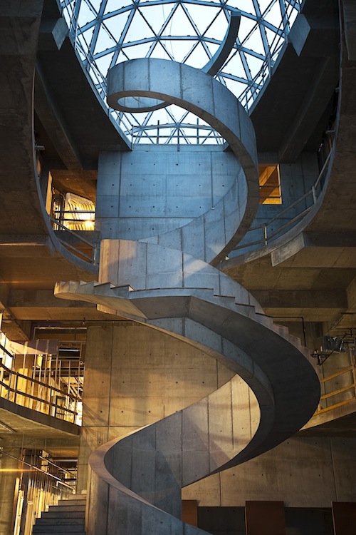
As for the inside, 66,000 square feet and 3 floors of huracaine 5 resistance structures, but the real eye catcher here is the staircase, which really takes Dalí's advice and pushes it to the extreme, defying structure and even gravity a bit. The staircase runs along all 3 floors of the space and takes the shape of a DNA molecule, another fetish of the man. To me, it looks like it was inspired on his funky mustache.
The Salvador Dalí Museum will open it's doors on January 2011 and it will house Dalí's largest collection of work, which is currently right outside of Spain, but the current building is in really bad shape, such bad shape that stormy, hurricane-prompt St. Pete made a better home.
I haven't been in site to see it with my own eyes, but from the pictures and even the critics, the building seems to be a really good fit to Dalí's taste and work. I am just glad that it is close to home and I won't have to travel all the way to Spain to go see the collection.
So with that, cheers to Dalí, cheers to HOK [and hopefully they read this and offer me a job] and cheers to 4 years of school. Let's hope they start paying off [the loans] soon enough.
Four years of model building and nonstop drafting, endless 3-D modeling and rendering hours, over 380 gallons of coffee and tons of sleepless night finally got me a piece of paper with funky looking, curly font! What a relief!
Sarcasm aside, I thought I'd celebrate [3 months after graduation] with a little architecture knowledge and throw in a couple of interesting projects I've seen lately. I also thought, 'why not dedicate every end/start of the month to ARCHITECTURE!' After all, I did spend forever learning about it, I might as well share a bit of what I know best and love most... But don't worry, I won't drown you in Architecture; I'll keep up with the other things as well.
And in talking about curly font and people with pretty signatures, I was reminded of Salvador Domingo Felipe Jacinto Dalí i Domènech.
 |
| Might as well throw in curly mustaches! |
Yes, most widely know as Salvador Dalí, though that was also his father's and brother's name. This eccentric surrealist Catalanian, known for his twisted and highly symbolic art [not to mention extremely hard to understand, and appealing mostly to adolecents of the time] is having his collection moved to... Of all places and very close to home... The beautiful but somewhat uninteresting St. Petersburg, Florida! Lucky us Floridians!
The collection's new house obviously has to be worth of Dalí's twisted personality and work, which is where professionals in my field come in, to build fantasy with concrete! Ah.. Architecture!
This time it was the architecture firm HOK, with Yann Weymouth in the lead, who took charge in designing a space as fantastic and surreal a Dalí' and his art.
The building is deeply inspired by Dalí's collection, combining realistic and classical elements with the fantasy of the contemporary. Dalí would be pretty proud.
 | |
| A combination of his fascination with the hypercube and folding? |
The building has already recieved several critics, but if you ask me, although I don't love the tumor looking glass or the chunky cube, the building is very appropiate for what this madman woulld have liked.
The space is very reminicent of Dalí's work, having a touch of his dripy folding clocks on to a cube, which also fascinated the man. The architecs say that the contrast between the "treasure box" which referes to the concrete orthagonal structure, and the "enigma," refering to the triangulated glass, is seen as a “contrast between the rational world of the conscious and the more intuitive, surprising natural world,” which is an element often present in Dalí's Art.
 |
| spiraling staircase |
As for the inside, 66,000 square feet and 3 floors of huracaine 5 resistance structures, but the real eye catcher here is the staircase, which really takes Dalí's advice and pushes it to the extreme, defying structure and even gravity a bit. The staircase runs along all 3 floors of the space and takes the shape of a DNA molecule, another fetish of the man. To me, it looks like it was inspired on his funky mustache.
The Salvador Dalí Museum will open it's doors on January 2011 and it will house Dalí's largest collection of work, which is currently right outside of Spain, but the current building is in really bad shape, such bad shape that stormy, hurricane-prompt St. Pete made a better home.
I haven't been in site to see it with my own eyes, but from the pictures and even the critics, the building seems to be a really good fit to Dalí's taste and work. I am just glad that it is close to home and I won't have to travel all the way to Spain to go see the collection.
So with that, cheers to Dalí, cheers to HOK [and hopefully they read this and offer me a job] and cheers to 4 years of school. Let's hope they start paying off [the loans] soon enough.
7.28.2010
35 movies: 1 minute [35mm]
[Simple vs. Simplistic]
Most people think these two words are synonyms of each other, but they are actually quite different. First, I must say that I love 'simple', but I strongly dislike 'simplistic'. Simple is the beauty of something created with the minimum possible amount of components to make it just right, without going too far to become simplistic. Simplistic becomes almost 'stupid' in a way, since it takes something complex and simplifies it so much, to the point where it lacks its original meaning and substance.
To explain this further, I've found a beautiful and simple piece of work by a couple of animators led by Pascal Monaco. They have taken 35 well known movies and simplified them into a 1 minute animation of beautiful and SIMPLE components, that still make it possible to abstractly recognize the given movie with just a few but key details about it.
It takes a few times to recognize all of them, but it is wisely composed and beautifully executed. Take a few shots at guessing and post your answers in a comment if you would like. I will post the answers in the near future.
Subscribe to:
Comments (Atom)